I have a little boy. Like many boys, he is a guys-guy and loves each and every superhero he can find. Sometimes I worry that he will become like the characters in Big Bang Theory – which I can live with as long has he is like Leonard and not the others lol! Anyway, I know more about superheroes than a woman my age normally would, although I don’t know all that much. The other day, however, I realised something: Superheroes are awesome at branding! Sure, they get help from the marketing geniuses behind the scenes, but still – awesome!
Here are 7 things that superheroes totally get right when it comes to branding!
1. Brand Essence
We can all spot a superhero. We always know when we have a superhero on our hands, what kind of superhero and what their “thing” is.
Superman is a kind hearted all-American hero in Kansas.
Batman is dark, complex, a serious billionaire.
Spiderman is a nimble teen swinging on a spider web.
Hulk is a big, green, angry giant.
etc….
2. Rich Brand Associations
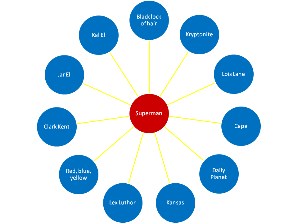
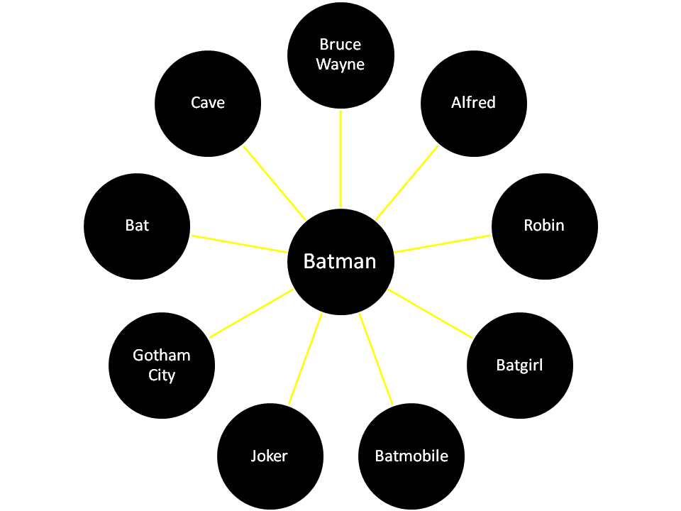
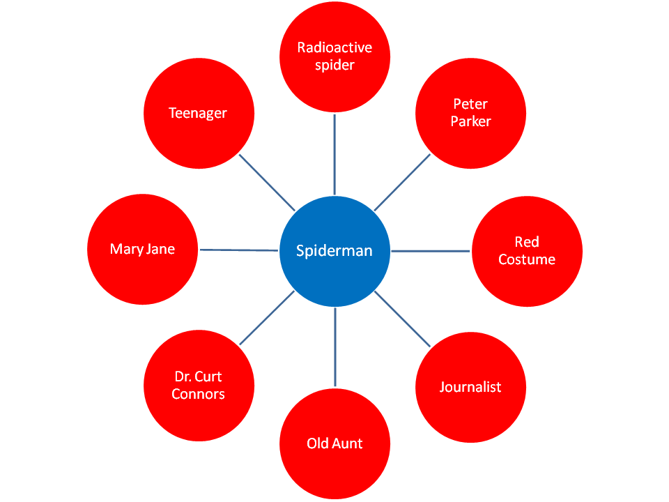
The brand essence is clear but that’s not all. When we think about these superheroes they conjure up a wealth of associations, thought, images and feelings.
Here are a few things most people would probably think of when we think of these well known superheroes:
3. Symbols
Comics and stories of superheroes are rich with symbols and it’s hard, if not impossible, to find a superhero without their own thing. Thor has got his hammer, Spiderman has his logo and cape, Batman has the bat, Hulk is green, Spiderman has, well, the spider and we could go on and on and on. We only need to see these symbols in passing and we know exactly who we are dealing with!
4. Strong Differentiation, Well Defined and Strong Characters
You could never accuse a superhero of being “me-too”. They are all different in their own way, none of them the same. They are all very strongly differentiated even though you could argue that for us as readers/ audience and for those they save they satisfy the same need. You can even find superheroes from the two giants, DC Comics and Marvel, that have a lot in common but are still totally different. The example that comes to mind is Ironman and Batman. They are both billionaires, neither of them has superpowers or gifts (except maybe otherwordly charm) but rely on technology and tricks. They are both mysterious, bitter and romantically troubled (although they of course have romantic relationships – it makes the story that much more interesting ;) … but they are by no means the same.
5. Rich Imagery
Think of all the images that a superhero conjures up in your mind. They all have their own world of images, all have their own distinctive look. Superman is Americana in Kansas, Batman is urban, dark and cool and Ironman is high tech and futuristic.
6. Consistency
One of the key aspects of branding is consistency. To always look the same and be easily recognisable. You want people to recognise you as soon as they see you, without ever seeing your name or logo. Think about the trailers for the latest Batman and Superman movies. They are a great example. It only took a few seconds for people to realise who it was, without seeing the superhero’s name or their strong symbol. Fantastic branding!
7. Everywhere and Again and Again and Again
Superheroes are everywhere and we see the same images of them again and again and again and again. This is key in firmly planting the brand in people’s minds – repeat, repeat, repeat, repeat, repeat, repeat, repeat, repeat, repeat, repeat, repeat, repeat, repeat, repeat, repeat, repeat, repeat, repeat, repeat, repeat…
Are you a superhero when it comes to branding?
Is there anything else you can think of that we can learn from superheroes when it comes to marketing?


